Wellness / Case study
Fēza Wellness
A calm digital home for practical well-being.
Explore the live website(opens in a new tab)- Sector
- Wellness
- Audience
- Individuals, families & workplaces
- Project focus
- Brand expression · Service discovery · Enquiry journeys
01 / The context
The brand behind the website.
Fēza brings practical well-being to individuals, families and workplaces. Its website introduces that approach through a warm, considered visual identity and a clear invitation to explore.
02 / The objective
What the experience needs to do.
Make a broad wellness offering feel personal and easy to explore.
A visitor might arrive looking for individual support, help for a young person, a calmer environment or a workplace programme. The design needs to communicate that breadth while keeping the experience reassuring. The central objective is to help people recognise where they fit and find an appropriate next step.
03 / The approach
The thinking behind the design.
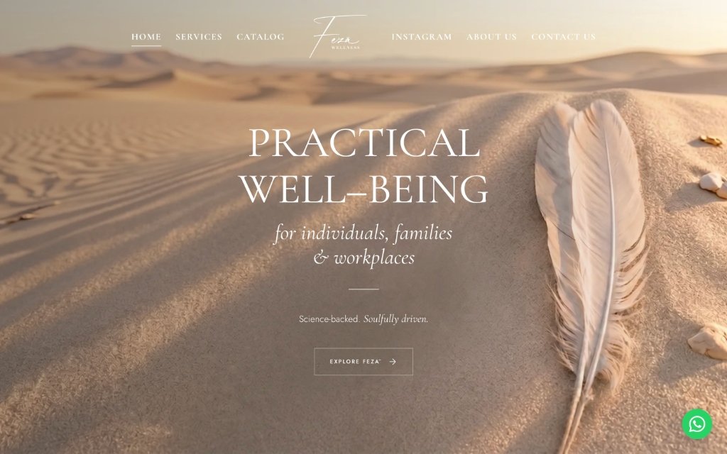
Soft desert imagery, generous space and expressive typography bring the brand's character into the browsing experience. Services and contact paths give visitors a straightforward way to take the next step.
Let the visual language set the pace
The desert landscape, feather imagery and warm neutral palette introduce the practice through a sense of calm. Large serif typography gives the core message room to breathe. Rather than competing for attention, the imagery and headline reinforce the same welcoming tone.
Organise around visitor needs
The service structure separates individual, environmental, workplace and youth support. This gives different audiences a recognisable starting point. A service can be explored in context before the visitor encounters an invitation to book or enquire.
Connect reassurance with a next step
Founder information, service explanations and frequently asked questions give visitors more context before making contact. The navigation also separates services from the product catalogue, keeping two different kinds of exploration easy to distinguish.
04 / The visitor journey
From first impression to next step.
Recognise the offer
The opening message introduces practical well-being and names the audiences it serves.
Find a relevant service
Visitors can explore support by personal, family, environmental or organisational need.
Build confidence
The founder story and frequently asked questions explain the practice and what to expect.
Start a conversation
Service-specific invitations lead towards booking or an enquiry, with contact information available throughout the site.
05 / In the website
Details that make it work.
Service-led navigation
Distinct routes into services, the catalogue, the brand story and contact.
Audience-specific explanations
Content that helps individuals, families and workplaces find relevant support.
Founder and FAQ content
Context that answers common questions before a visitor gets in touch.
A separate product catalogue
Space for the wellness collection alongside the practice’s services.
06 / The delivered experience
A welcoming introduction to the brand, with wellness at the centre of the story.
The strength of this experience is the connection between tone and structure. A calm first impression draws people into the brand; clear service groupings help them navigate a varied offering. The website gives a Dubai-based wellness practice a coherent home for its services, story, collection and enquiries.
Next case study / Hygiene & care
Sun Group
Two countries. One connected brand story.
Explore the project